The CSS Way: How to Block UI only in Landscape Mode & in Mobile?
Overview
Have you ever found any website irritating in landscape mode?
I have been in a situation that I don’t want users to navigate my web application in landscape mode because of any reason (I do have my reasons).
Things to do
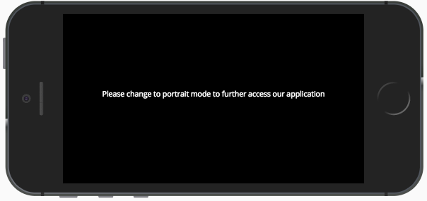
1. Add an element with the appropriate message in your HTML.
1
2
3
  <div class="block-ui__wrapper">
    <p>Please change to portrait mode to further access our application</p>
  </div>
2. Spread that element to the whole viewport
Once you add the block element, fix it to the viewport and block the whole screen. Style it as per your brand guidelines and make sure that it is not visible by default.
Now is the time to display the hidden element in landscape view. Below is the code for the same. Further, used Flexbox just to center align the inner content to the viewport.
@media(max-width:767px)and(-webkit-min-device-pixel-ratio:2)and(orientation:landscape) {
.block-ui__wrapper {
display: block;
/*
However, here is some extra snacks for you.
To align everything in center.
*/display: -webkit-box;
display: -webkit-flex;
display: -moz-box;
display: -ms-flexbox;
display: flex;
-webkit-box-pack: center;
-webkit-justify-content: center;
-moz-box-pack: center;
-ms-flex-pack: center;
justify-content: center;
-webkit-box-align: center;
-webkit-align-items: center;
-moz-box-align: center;
-ms-flex-align: center;
align-items: center;
}
}
4. Prevent the scrolling
Wrap all the content (HTML elements) into one. Target and give the styling like in the below example. This will prevent the scrolling in both the mobile devices and screen-based devices.
Masoom is a Front-end Developer, a UX Engineer and Freelancer based in Bangalore, India. Like to develop differential and effective User Experiences for digital products using an amalgamation of latest technology and best practises.