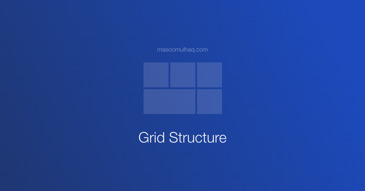
Best Practices to Avoid Nested Grid Hell in CSS
If you’re a UI developer, you might have heard about girds & grid structure during the development process. Most of the developers get confused about when to use & when not to use grids. In this article, hopefully, we will have clarity on all these confusions with girds.
Note: We are not talking about CSS grids but general girds
Understanding Grids
Grids structure is the representation or arrangement of the blocks or content in rows & columns. To understand grids, we need to know two things which are grids & gutters.
Grids are simply the blocks that hold contents like image, paragraph, headings, etc., Gutter is the space or gap provided between each grid.
Grids hold content & Gutter provides space between grids
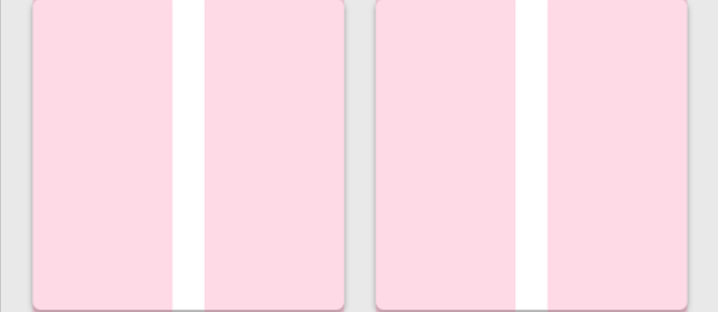
Grids & Gutters
In the above image, pink blocks represent girds & space between those pink blocks represents gutter.
It’s all up to you how you want to distribute your grids, in general, we follow 12 girds or 16 grids. Here are a few assumptions for our demonstration:
- Considering 12 grids structure
- Using Bootstrap classes
- Understanding Grids with 3 problem statements
Design #1
In our first design given below, we have 3 blocks distributed in a row with the same widths & spacings between them.

Design #1 Approach
Approach:
As we are following 12 grid-structure, if we want to divide these 3 blocks equally in a container, each should occupy 4 grids (12/3 = 4) and if the gird structure is changing the different screen resolutions, you should accommodate than as well.
Code:
| |
In case, if it’s a responsive design. code will be something like this:
| |
Design #2
Let’s come to our second design. In this, we have 2 blocks distributed in a row with unequal widths. But the width of the image should be fixed for each resolution. Which means image width is not fluid.
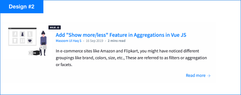
Design #2 Approach
Approach:
We can achieve this couple of ways. 1st solution will be with grids and 2nd solution will be with bootstrap media objects (or even with CSS Flexbox). In my opinion, I would use media objects for the current problem.
Why? Bootstrap girds are fluid, but our image is having fixed dimensions. So, to make it work, we much override or even we end up writing extra code to this simple block. But with the second approach, we achieved everything in the problem statement without any extra code and also following best practices by using a relevant component for the design given.
Code:
| |
Bonus:
If you not targetting for responsiveness, here is the code snippet with grids:
| |
Design #3
Now, this is our final design. In this, we have a nested grid structure, two outer grids holding 2 new blocks inside. And each inner block holder 2 more blocks with image & text same as in our Design #2.
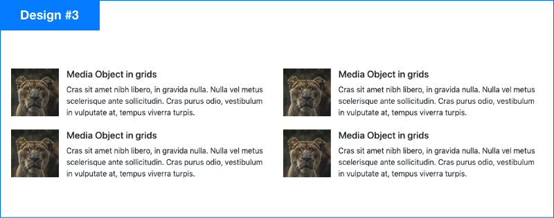
Design #3 Approach
Approach:
First, we need to divide each column & then we must follow #2 approach for the inner blocks. It is not always advisable to use girds when you see some components divided with grids (in your design). We must understand which approach fits better with the design.
If you have a fluid content design, then go with grids. Otherwise, you must think of a different approach based on the design, In our case, we will be using media object for the inner elements in each column. And our code goes like this:
Code:
| |
Conclusion
To put everything in a nutshell, use grids when you have fluid (responsive) content & try to avoid using when you have fixed content(Ex: fixed image). Just because it fits in gird, we will not use girds. Understanding the design keeping all the different scenarios in mind for all the responsive screens you are supporting. Hope this gives some context on grids usage. Thank you!