The CSS Way: 3 Tricks to Resolve Image Stretching Issues in your Website
Landing pages, banners, carousel, blog posts, cards, grids. Well, we use images mostly everywhere to bring life to our site and when we are working with image the most common issue is with an aspect ratio of the images.
In this article, we will be looking into 3 CSS solutions to prevent images from getting stretched in our web pages.
We will be using the below sample image throughout the article:
Sample Image (Courtesy picsum.photos)
Trick 1: The Famous [max-width] Trick
This is the most used trick so far. Let’s understand this with an example.
1.1. Example with max-width
| |
When you added max-width: 100%; to any image, the width will be adjusted automatically based on the outer element width and you know what height: auto; does as it’s self-explanatory.
Example with [max-width: 100%]
This is the fix we have been using for years to prevent image stretching in our sites.
Well, let’s think about a scenario:
Image should not look stretched when we lock the height of the image and width should be fluid as per the container’s width.
In this case, we need to do something more and let’s look into that now.
1.2. When to use [max-width: 100%]
This is a very common requirement. We use this when we do not have any constraints with the dimensions to follow and width either should fit as per the container or should not overflow out of the container.
1.3. Browser Support of max-width
Well, max-width has solid browser support, even supports IE since version 7. Refer to the screenshot below:
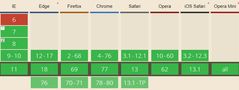
Courtesy caniuse.com
Trick 2: The Background Image Trick
By using an image in the background and by tweaking background-size & background-position properties we can make this possible. Here is an example below.
2.1. Example with Background Image
HTML code:
| |
CSS code:
| |
Result display:
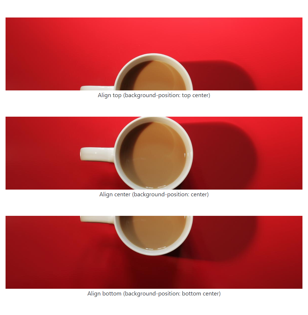
Example with image in background
View external output here.
2.2. When to use
We have an image used in background and size needs to be adujusted to any fixed dimensions (width or height or both). This the ideal case to use trick #2.
2.3. Browser Support of background-size
Browser support for solution #2 is pretty good. Refer below screenshot:
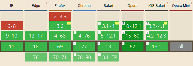
Courtesy caniuse.com
Trick 3: The [object-fit] Trick
In this trick, we will be applying some styles to img tag directly and achieve the same thing we achieved in the previous trick. Key properties for this trick will be object-fit & object-position. Let’s see the results with the example below.
3.1. Example with object-fit
HTML code:
| |
CSS code:
| |
Result display:
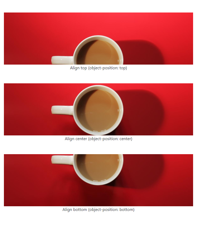
Example with object-fit
View external output here.
3.2. When to use
Assume we have images with img tag in our page and size needs to be adusjted to any fixed dimension (width or height or both). This the ideal case to use trick #3.
3.3. Browser Support of object-fit
Browser support is not bad except:
- IE does not support
object-fit&object-position. - Edge has partial support.
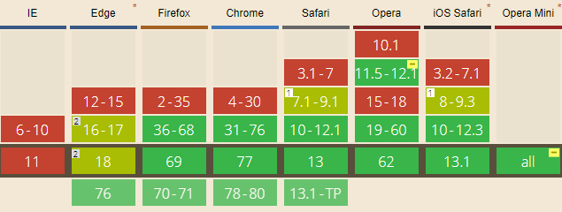
Courtesy caniuse.com
Conclusion
These 3 tricks have 3 different usecase. However, trick #2 & trick #3 are similar in a way but with a different usecase.
That’s it! Hope you like this article. In case of any queries, comment below in the comment box.